Friday, 22 October 2010

Evaluation - College magazine

My collage magazine uses forms and conventions of a real magazine product as it has a Masthead. All magazines have a Masthead usually something memorable and catchy it is the first thing you see on a magazine as it is placed at the top and usually the boldest thing. It is important as it is the name of the magazine and it won’t change, as in every magazine issue the Masthead always stays the same. My magazine also has a main image, this is to give a better impression of the ideology of the magazine as it shows what the collage expects from a typical student all magazines have an image and it usually relates to the issue. E.g. if it was a fashion magazine they would have a well dresses fashionable model, or a music magazine they would have a band. As mine is a collage magazine I had a college student representing the collage in a positive way. It also has cover lines to tell you what the issue is about and what the stories are inside the magazine. All magazines have this connotation as you need this as part of a preview to the magazine.

My collage magazine represents every student within the collage, as I only had one student on my front cover what was a female this may not give off the correct impression that I wanted as I want it to represent that everyone in the collage is equal although I would change the models in my pictures in every issue of my collage magazine. This is also why I did quite subtle colours as I didn’t want it to look too bright, colourful and give off the impression that it is just target at girls. The model I chose is dressed appropriately and doesn’t have no facial piercing or anything that would represent the college in a negative way. I think that she gives an overall good impression.

The audience for my magazine is the college students. I tried to appeal to my audience as I used a collage student for the picture, they would be able to relate to this more as it is likely to be someone who they have seen around there collage and as we have only just stared the new tear they may want to learn things about people in the collage and what is available in the college facilities. The cover lines that I used would appeal to the college students as it is to do with what is going on in the collage and things what they should know about the collage. It would inform the collage student on what the collage is doing and also what the student executives are doing. It will also tell them how to put their own opinions forward. Also my masthead is called YOU what gives the impression that I am talking directly to you. It gives a better feel of communication with my magazine. Also as I am a Wyke collage student myself I think they would be interested as we are in the same age group and would most properly be interested in the same types of things.

From constructing my magazine I have learnt that I need to have a little bit more practise on Photoshop as I find this difficult software to work with. Although by using this software it has become easier to understand.


Draft of contents

My magazine front cover

Wednesday, 20 October 2010

Pictures - College magazine

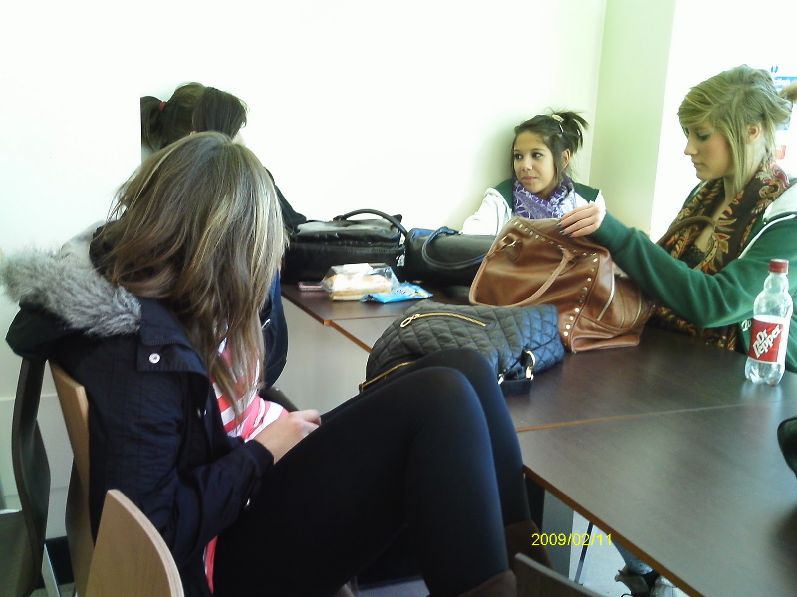
When taking my pictures for my collage magazine I needed to think of the surroundings and settings I wanted in my picture. I took several pictures on a plain white background and on a concrete wall, all in collage. I didn’t want the background to look to busy this is why I didn’t take my front cover image in a busy area around collage such as in the canteen or a lesson. I also took some pictures of the collage building and people socializing in collage as I thought this may come in handy on my content page. I wanted my pictures to represent a friendly collage and the ideology of the collage being that if 'YOU' try and put your all into it you can’t achieve and it is down to. It is all about self independence and working in a friendly college environment. So I wanted my model to look happy and independent this is why I decided that I only wanted one person in the front cover image.


Basic plan - College magazine

I compared my sketches and come up with a basic plan of where I want the text in my magazine. I decided that i liked the images to the left of the page as if I had it in the middle I wouldn’t have much room for cover lines. Also when someone looks at the magazine there eyes are drawn to the middle of the magazine, this would be the cover line and the picture so they are physically drawn to both of them. I also liked the idea of only having one student model as I didn’t want the page to be too busy.

Basic sketches - College magazine

I did four basic sketch ideas of what I want the front cover of my magazine to look like and the layout of it. I looked that where I wanted the text in the magazine. I tried putting the mast head in different places, vertical and horizontal and the images with the model central or to the left or right. Also with one or two people in the picture. I would like my magazine to appeal to the target audience of Wyke collage students so I wanted a Wyke collage student to be the model in my picture. I didn’t want to man conventions as I don’t want it to look to busy although I want everything that is needed to be included such as the masthead, slogan, cover lines an image and the collage logo.

Mast head name - College Magazine

Planning for the front cover:
The first thing when thinking how I want my magazine, is to think of a mast head.  As it is aimed at collage student I want it to connect with education at Wyke and learning. I also want it to be aimed at a younger audience therefore I want it to still connect to the teenage audience so it needs to be modern.
Wired:  I thought that wired would be an appropriate name for my collage magazine, it would represent the students in Wyke. They are ‘tune in’ in their lessons and involve themselves. They are wired up. It reflects more the education in the collage. My slogan would be ‘get tuned in’ it shows that Wyke wants people to achieve, do well and to go far.
Connected:  Connected gives a different view to Wyke. That Wyke connects lots of different people in the collage and it helps people to find a new path to a good future. If I used this name the slogan would be ‘bringing people together’ this gives the ideology of Wyke is to have a friendly environment that they want everyone to get along.
YOU -   I thought you would be a good name as when you are in collage you make your own choices and its only you who can determined you own future. It gives the ideology that the students in the collage have their own independence and your success is down to you. My slogan would be YOURS. OWN IT. USE IT. Its snappy and it uses repetition to make the words more powerful. It also means that the collage is yours use it to your best potential and get the most out of it that you can.  The letters of the words also spell out YOU.

I then decided the name I was going to choose for my magazine. I chose YOU as I thought this would appeal to my target audience more as it is more interactive with them and it is directly aimed at them ‘you’.  I thought it was very appropriate as its showing that there future is in their own hands and they are free to do what they want although the way to get far in life is to use collage and its facilities, get on with your work and you will succeed. Also in my magazine i want it to be about the collage students and what is going on within the collage so this name would also be appropriate as the articles would be about YOU.